

 Facebook
 X
X
 Pinterest
 Copy Link
Looking to update the interior of your home? Check this article from the National Association of Realtors.
The 60-30-10 Way to Add Color Without Going Overboard
(link to original article)
There’s a formula that can help guide you in bringing more color to warm up a space, while also staying cohesive.
All-white or all-gray interiors are becoming forgettable. More homeowners are adding color with pinks, greens, blues and yellows. But all that color from room to room can make a home feel disjointed and overwhelming.
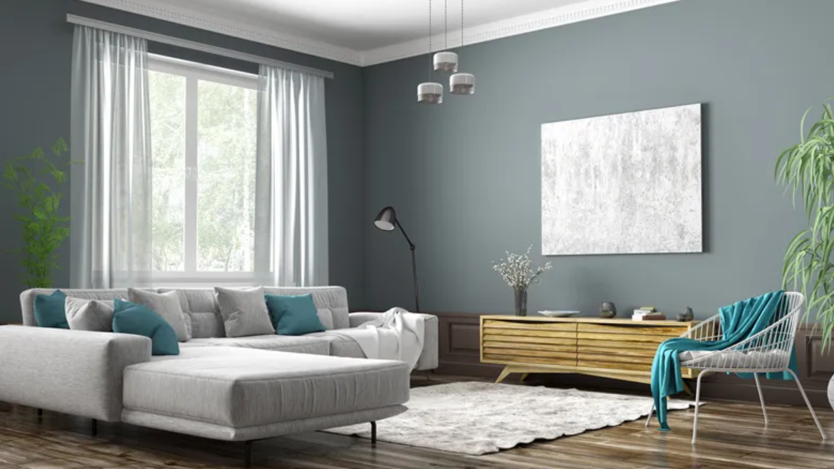
So how do you add more color while still making it feel cohesive? Designers like to break it down into a formula: 60-30-10. Here’s how it works:
60% of the room should be one color. Consider this your main base color, like using a soft gray or white for your walls. Make this color dominate your space on walls and in larger accents, like an area rug. But you don’t have to use the same hue with everything. Use variations of the color, like a soft or dark gray.
30% should be a complementary color. This should support your main color, but it can still be different enough to add some contrast. Use it for draperies, chairs, accent walls or furniture.
10% should be your accent color. Embrace the latest bright hues, like Pantone’s “Viva Magenta” or Benjamin Moore’s “Raspberry Blush,” a fiery red-orange hue. You don’t have to go bold, however. Your accent color could be black or a natural material, like wood or metal. The main idea is to provide a contrast to your dominant and secondary colors. Weave in your accent color for throw pillows, ottoman, artwork or small decorative accessories.
Moving.com provided a couple of examples for how to use this formula:
Dominant color: White
Secondary color: Gray
Accent: Red
Or:
Dominant color: Gray
Secondary color: White
Accent: Pink
By following a formula, you can embrace color trends while still making a space feel cohesive. The formula helps to strike a balance with color but should be merely used as a guide.


